找回密碼
 立即註冊
搜索
熱搜: 活動 交友 discuz
查看: 725|回復: 2

警告視窗 sweetalert2

[複製鏈接]

257

主題

38

回帖

1138

積分

管理員

積分
1138
發表於 2023-5-25 10:50:32 | 顯示全部樓層 |閱讀模式

EXAMPLES

  • A basic message

     
    Swal.fire('Any fool can use a computer')
  • A title with a text under

     
    Swal.fire(
      'The Internet?',
      'That thing is still around?',
      'question'
    )
  • A modal with a title, an error icon, a text, and a footer

     
    Swal.fire({
      icon: 'error',
      title: 'Oops...',
      text: 'Something went wrong!',
      footer: '<a href="">Why do I have this issue?</a>'
    })
  • A modal window with a long content inside:

     
    Swal.fire({
      imageUrl: 'https://placeholder.pics/svg/300x1500',
      imageHeight: 1500,
      imageAlt: 'A tall image'
    })
  • Custom HTML description and buttons with ARIA labels

     
    Swal.fire({
      title: '<strong>HTML <u>example</u></strong>',
      icon: 'info',
      html:
        'You can use <b>bold text</b>, ' +
        '<a href="//sweetalert2.github.io">links</a> ' +
        'and other HTML tags',
      showCloseButton: true,
      showCancelButton: true,
      focusConfirm: false,
      confirmButtonText:
        '<i class="fa fa-thumbs-up"></i> Great!',
      confirmButtonAriaLabel: 'Thumbs up, great!',
      cancelButtonText:
        '<i class="fa fa-thumbs-down"></i>',
      cancelButtonAriaLabel: 'Thumbs down'
    })
  • A dialog with three buttons

     
    Swal.fire({
      title: 'Do you want to save the changes?',
      showDenyButton: true,
      showCancelButton: true,
      confirmButtonText: 'Save',
      denyButtonText: `Don't save`,
    }).then((result) => {
      /* Read more about isConfirmed, isDenied below */
      if (result.isConfirmed) {
        Swal.fire('Saved!', '', 'success')
      } else if (result.isDenied) {
        Swal.fire('Changes are not saved', '', 'info')
      }
    })
  • A custom positioned dialog

     
    Swal.fire({
      position: 'top-end',
      icon: 'success',
      title: 'Your work has been saved',
      showConfirmButton: false,
      timer: 1500
    })
  • Custom animation with Animate.css 

     
    Swal.fire({
      title: 'Custom animation with Animate.css',
      showClass: {
        popup: 'animate__animated animate__fadeInDown'
      },
      hideClass: {
        popup: 'animate__animated animate__fadeOutUp'
      }
    })
  • A confirm dialog, with a function attached to the "Confirm"-button

     
    Swal.fire({
      title: 'Are you sure?',
      text: "You won't be able to revert this!",
      icon: 'warning',
      showCancelButton: true,
      confirmButtonColor: '#3085d6',
      cancelButtonColor: '#d33',
      confirmButtonText: 'Yes, delete it!'
    }).then((result) => {
      if (result.isConfirmed) {
        Swal.fire(
          'Deleted!',
          'Your file has been deleted.',
          'success'
        )
      }
    })
  • ... and by passing a parameter, you can execute something else for "Cancel"

     
    const swalWithBootstrapButtons = Swal.mixin({
      customClass: {
        confirmButton: 'btn btn-success',
        cancelButton: 'btn btn-danger'
      },
      buttonsStyling: false
    })
    
    swalWithBootstrapButtons.fire({
      title: 'Are you sure?',
      text: "You won't be able to revert this!",
      icon: 'warning',
      showCancelButton: true,
      confirmButtonText: 'Yes, delete it!',
      cancelButtonText: 'No, cancel!',
      reverseButtons: true
    }).then((result) => {
      if (result.isConfirmed) {
        swalWithBootstrapButtons.fire(
          'Deleted!',
          'Your file has been deleted.',
          'success'
        )
      } else if (
        /* Read more about handling dismissals below */
        result.dismiss === Swal.DismissReason.cancel
      ) {
        swalWithBootstrapButtons.fire(
          'Cancelled',
          'Your imaginary file is safe :)',
          'error'
        )
      }
    })
  • A message with a custom image

     
    Swal.fire({
      title: 'Sweet!',
      text: 'Modal with a custom image.',
      imageUrl: 'https://unsplash.it/400/200',
      imageWidth: 400,
      imageHeight: 200,
      imageAlt: 'Custom image',
    })
  • A message with custom width, padding, background and animated Nyan Cat

     
    Swal.fire({
      title: 'Custom width, padding, color, background.',
      width: 600,
      padding: '3em',
      color: '#716add',
      background: '#fff url(/images/trees.png)',
      backdrop: `
        rgba(0,0,123,0.4)
        url("/images/nyan-cat.gif")
        left top
        no-repeat
      `
    })
  • A message with auto close timer

     
    let timerInterval
    Swal.fire({
      title: 'Auto close alert!',
      html: 'I will close in <b></b> milliseconds.',
      timer: 2000,
      timerProgressBar: true,
      didOpen: () => {
        Swal.showLoading()
        const b = Swal.getHtmlContainer().querySelector('b')
        timerInterval = setInterval(() => {
          b.textContent = Swal.getTimerLeft()
        }, 100)
      },
      willClose: () => {
        clearInterval(timerInterval)
      }
    }).then((result) => {
      /* Read more about handling dismissals below */
      if (result.dismiss === Swal.DismissReason.timer) {
        console.log('I was closed by the timer')
      }
    })
  • Right-to-left support for Arabic, Persian, Hebrew, and other RTL languages

     
    Swal.fire({
      title: 'هل تريد الاستمرار؟',
      icon: 'question',
      iconHtml: '؟',
      confirmButtonText: 'نعم',
      cancelButtonText: 'لا',
      showCancelButton: true,
      showCloseButton: true
    })
  • AJAX request example

     
    Swal.fire({
      title: 'Submit your Github username',
      input: 'text',
      inputAttributes: {
        autocapitalize: 'off'
      },
      showCancelButton: true,
      confirmButtonText: 'Look up',
      showLoaderOnConfirm: true,
      preConfirm: (login) => {
        return fetch(`//api.github.com/users/${login}`)
          .then(response => {
            if (!response.ok) {
              throw new Error(response.statusText)
            }
            return response.json()
          })
          .catch(error => {
            Swal.showValidationMessage(
              `Request failed: ${error}`
            )
          })
      },
      allowOutsideClick: () => !Swal.isLoading()
    }).then((result) => {
      if (result.isConfirmed) {
        Swal.fire({
          title: `${result.value.login}'s avatar`,
          imageUrl: result.value.avatar_url
        })
      }
    })

DOWNLOAD & INSTALL

$ npm install sweetalert2

Or grab from jsdelivr CDN 

<script src="//cdn.jsdelivr.net/npm/sweetalert2@11"></script>

sweetalert2 is the 23rd most popular package on jsDelivr, with 865,217,144 CDN hits in the last month

USAGE

1. Initialize the plugin by referencing the necessary files:

<script src="sweetalert2.all.min.js"></script>

You can also include the stylesheet separately if desired:

<script src="sweetalert2.min.js"></script>
<link rel="stylesheet" href="sweetalert2.min.css">

Or

// ES6 Modules or TypeScript
import Swal from 'sweetalert2'

// CommonJS
const Swal = require('sweetalert2')

It's possible to import JS and CSS separately, e.g. if you need to customize styles:

import Swal from 'sweetalert2/dist/sweetalert2.js'

import 'sweetalert2/src/sweetalert2.scss'

2. Call the sweetAlert2-function after the page has loaded

Swal.fire({
  title: 'Error!',
  text: 'Do you want to continue',
  icon: 'error',
  confirmButtonText: 'Cool'
})

INTEGRATIONS WITH MAJOR JS FRAMEWORKS

CONFIGURATION

Here are the keys that you can use if you pass an object into sweetAlert2:

Argument
(Default value)
Description
title
''
The title of the popup, as HTML.
titleText
''
The title of the popup, as text. Useful to avoid HTML injection.
html
''
A HTML description for the popup.
If text and html parameters are provided in the same time, html will be used.
[Security] SweetAlert2 does NOT sanitize this parameter. It is the developer's responsibility to escape any user input when using the html option, so XSS attacks would be prevented.
text
''
A description for the popup.
If text and html parameters are provided in the same time, html will be used.
icon
undefined
The icon of the popup. SweetAlert2 comes with 5 built-in icon which will show a corresponding icon animation: warningerrorsuccessinfo, and question. It can either be put in the array under the key "icon" or passed as the third parameter of the function.
iconColor
undefined
Use this to change the color of the icon.
iconHtml
undefined
The custom HTML content for an icon.
showClass
{
  popup: 'swal2-show',
  backdrop: 'swal2-backdrop-show',
  icon: 'swal2-icon-show'
}
CSS classes for animations when showing a popup (fade in)
hideClass
{
  popup: 'swal2-hide',
  backdrop: 'swal2-backdrop-hide',
  icon: 'swal2-icon-hide'
}
CSS classes for animations when hiding a popup (fade out)
backdrop
true
Whether or not SweetAlert2 should show a full screen click-to-dismiss backdrop. Can be either a boolean or a string which will be assigned to the CSS background property.
toast
false
Whether or not an alert should be treated as a toast notification. This option is normally coupled with the position parameter and a timer. Toasts are NEVER autofocused.
target
'body'
The container element for adding popup into.
input
undefined
Input field type, can be textemailpasswordnumbertelrangetextareaselectradiocheckboxfile and url.
width
undefined
Popup window width, including paddings (box-sizing: border-box). Can be in px or %. The default width is 32rem.
padding
undefined
Popup window padding. The default padding is 1.25rem.
color
undefined
Color for title, content and footer (CSS color property). The default color is '#545454'.
background
undefined
Popup window background (CSS background property). The default background is '#fff'.
position
'center'
Popup window position, can be 'top''top-start''top-end''center''center-start''center-end''bottom''bottom-start', or 'bottom-end'.
grow
false
Paired with window position, sets the direction the popup should grow in, can be set to 'row''column''fullscreen', or false.
customClass
undefined
A custom CSS class for the popup:
customClass: {
  container: '...',
  popup: '...',
  header: '...',
  title: '...',
  closeButton: '...',
  icon: '...',
  image: '...',
  content: '...',
  htmlContainer: '...',
  input: '...',
  inputLabel: '...',
  validationMessage: '...',
  actions: '...',
  confirmButton: '...',
  denyButton: '...',
  cancelButton: '...',
  loader: '...',
  footer: '....'
}
timer
undefined
Auto close timer of the popup. Set in ms (milliseconds). See also Swal.getTimerLeft()Swal.stopTimer()Swal.resumeTimer()Swal.toggleTimer()Swal.isTimerRunning() and Swal.increaseTimer().
timerProgressBar
false
If set to true, the timer will have a progress bar at the bottom of a popup. Mostly, this feature is useful with toasts.
heightAuto
true
By default, SweetAlert2 sets html's and body's CSS height to auto !important. If this behavior isn't compatible with your project's layout, set heightAuto to false.
allowOutsideClick
true
If set to false, the user can't dismiss the popup by clicking outside it.
You can also pass a custom function returning a boolean value, e.g. if you want to disable outside clicks for the loading state of a popup.
allowEscapeKey
true
If set to false, the user can't dismiss the popup by pressing the Esc key. You can also pass a custom function returning a boolean value, e.g. if you want to disable the Esc key for the loading state of a popup.
allowEnterKey
true
If set to false, the user can't confirm the popup by pressing the Enter or Space keys, unless they manually focus the confirm button. You can also pass a custom function returning a boolean value.
stopKeydownPropagation
true
If set to false, SweetAlert2 will allow keydown events propagation to the document.
keydownListenerCapture
false
Useful for those who are using SweetAlert2 along with Bootstrap modals. By default keydownListenerCapture is false which means when a user hits Esc, both SweetAlert2 and Bootstrap modals will be closed. Set keydownListenerCapture to true to fix that behavior.
showConfirmButton
true
If set to false, a "Confirm"-button will not be shown.
showDenyButton
false
If set to true, a "Deny"-button will be shown. It can be useful when you want a popup with 3 buttons.
showCancelButton
false
If set to true, a "Cancel"-button will be shown, which the user can click on to dismiss the modal.
confirmButtonText
'OK'
Use this to change the text on the "Confirm"-button.
denyButtonText
'No'
Use this to change the text on the "Deny"-button.
cancelButtonText
'Cancel'
Use this to change the text on the "Cancel"-button.
confirmButtonColor
undefined
Use this to change the background color of the "Confirm"-button. The default color is #3085d6
denyButtonColor
undefined
Use this to change the background color of the "Deny"-button. The default color is #dd6b55
cancelButtonColor
undefined
Use this to change the background color of the "Cancel"-button. The default color is #aaa
confirmButtonAriaLabel
''
Use this to change the aria-label for the "Confirm"-button.
denyButtonAriaLabel
''
Use this to change the aria-label for the "Deny"-button.
cancelButtonAriaLabel
''
Use this to change the aria-label for the "Cancel"-button.
buttonsStyling
true
Apply default styling to buttons. If you want to use your own classes (e.g. Bootstrap classes) set this parameter to false.
reverseButtons
false
Set to true if you want to invert default buttons positions ("Confirm"-button on the right side).
focusConfirm
true
Set to false if you want to focus the first element in tab order instead of "Confirm"-button by default.
returnFocus
true
Set to false if you don't want to return the focus to the element that invoked the modal after the modal is closed.
focusDeny
false
Set to true if you want to focus the "Deny"-button by default.
focusCancel
false
Set to true if you want to focus the "Cancel"-button by default.
showCloseButton
false
Set to true to show close button in top right corner of the popup.
closeButtonHtml
'&times;'
Use this to change the content of the close button.
closeButtonAriaLabel
'Close this dialog'
Use this to change the aria-label for the close button.
loaderHtml
''
Use this to change the HTML content of the loader.
showLoaderOnConfirm
false
Set to true to disable buttons and show the loader instead of the Confirm button. Use it in combination with the preConfirm parameter.
showLoaderOnDeny
false
Set to true to disable buttons and show the loader instead of the Deny button. Use it in combination with the preDeny parameter.
scrollbarPadding
true
Set to false to disable body padding adjustment when the page scrollbar gets hidden while the popup is shown
preConfirm
undefined
Function to execute before confirming, may be async (Promise-returning) or sync.
Returned (or resolved) value can be:
  • false to prevent a popup from closing
  • anything else to pass that value as the result.value of Swal.fire()
  • undefined to keep the default result.value
See usage example.
preDeny
undefined
Function to execute before denying, may be async (Promise-returning) or sync.
Returned (or resolved) value can be:
  • false to prevent a popup from closing
  • anything else to pass that value as the result.value of Swal.fire()
  • undefined to keep the default result.value
returnInputValueOnDeny
false
If you want to return the input value as result.value when denying the popup, set to true. Otherwise, the denying will set result.value to false.
imageUrl
undefined
Add a customized icon for the popup. Should contain a string with the path or URL to the image.
imageWidth
undefined
If imageUrl is set, you can specify imageWidth to describes image width in px.
imageHeight
undefined
Custom image height in px.
imageAlt
''
An alternative text for the custom image icon.
inputLabel
''
Input field label.
inputPlaceholder
''
Input field placeholder.
inputValue
''
Input field initial value.

If the input type is selectinputValue will represent the selected <option> tag.

If the input type is checkboxinputValue will represent the checked state.

If the input type is textemailnumbertel or textarea a Promise can be accepted as inputValue.
inputOptions
{}
If input parameter is set to "select" or "radio", you can provide options. Can be a Map or a plain object, with keys that represent option values and values that represent option text. You can also provide plain object or Map as values that will represented a group of options, being the label of this <optgroup> the key. Finally, you can also provide a Promise that resolves with one of those types.
inputAutoTrim
true
Automatically remove whitespaces from both ends of a result string. Set this parameter to false to disable auto-trimming.
inputAttributes
{}
HTML input attributes (e.g. minmaxautocompleteaccept), that are added to the input field. Object keys will represent attributes names, object values will represent attributes values.
inputValidator
undefined
Validator for input field, may be async (Promise-returning) or sync.
Returned (or resolved) value can be:
  • falsy value (undefinednullfalse) for indicating success
  • a string value (error message) for indicating failure
See usage example.
validationMessage
undefined
A custom validation message for default validators (email, url).
progressSteps
[]
Progress steps, useful for queues.
currentProgressStep
undefined
Current active progress step.
progressStepsDistance
undefined
Distance between progress steps.
willOpen
undefined
Popup lifecycle hook. Synchronously runs before the popup is shown on screen. Provides popup DOM element as the argument.
didOpen
undefined
Popup lifecycle hook. Asynchronously runs after the popup has been shown on screen. Provides popup DOM element as the argument.
didRender
undefined
Popup lifecycle hook. Synchronously runs after the popup DOM has been updated (ie. just before the popup is repainted on the screen).
Provides popup DOM element as the argument.
Typically, this will happen after Swal.fire() or Swal.update().
If you want to perform changes in the popup's DOM, that survive Swal.update(), prefer didRender over willOpen.
willClose
undefined
Popup lifecycle hook. Synchronously runs when the popup closes by user interaction (and not due to another popup being fired). Provides popup DOM element as the argument.
didClose
undefined
Popup lifecycle hook. Asynchronously runs after the popup has been disposed by user interaction (and not due to another popup being fired).
didDestroy
undefined
Popup lifecycle hook. Synchronously runs after popup has been destroyed either by user interaction or by another popup.
If you have cleanup operations that you need to reliably execute each time a popup is closed, prefer didDestroy over didClose.

You can easily reuse configuration by creating your own Swal with Swal.mixin({ ...options }):

  • Mixin example

     
    const Toast = Swal.mixin({
      toast: true,
      position: 'top-end',
      showConfirmButton: false,
      timer: 3000,
      timerProgressBar: true,
      didOpen: (toast) => {
        toast.addEventListener('mouseenter', Swal.stopTimer)
        toast.addEventListener('mouseleave', Swal.resumeTimer)
      }
    })
    
    Toast.fire({
      icon: 'success',
      title: 'Signed in successfully'
    })

DECLARATIVE TEMPLATES AND DECLARATIVE TRIGGERING

There's also the declarative way to define a popup, via the <template> tag. This is handy when you want to define popup on server side (SSR).

  • Declarative template example

     
    <template id="my-template">
      <swal-title>
        Save changes to "Untitled 1" before closing?
      </swal-title>
      <swal-icon type="warning" color="red"></swal-icon>
      <swal-button type="confirm">
        Save As
      </swal-button>
      <swal-button type="cancel">
        Cancel
      </swal-button>
      <swal-button type="deny">
        Close without Saving
      </swal-button>
      <swal-param name="allowEscapeKey" value="false" />
      <swal-param
        name="customClass"
        value='{ "popup": "my-popup" }' />
    </template>
    Swal.fire({
      template: '#my-template'
    })

Supported template elements:

<swal-title>...</swal-title>
<swal-html>...</swal-html>
<swal-footer>...</swal-footer>
<swal-param name="..." value="..." />
<swal-button type="..." color="..." aria-label="...">...</swal-button>
<swal-image src="..." width="..." height="..." alt="..." />
<swal-icon type="..." color="...">...</swal-icon>
<swal-input type="..." label="..." placeholder="..." value="..." />
<swal-input-option value="...">...</swal-input-option>

And you can even trigger SweetAlert2 popups declaratively! Use the bindClickHandler() method for that:

  •  
     
    <button data-swal-template="#my-template">
      Trigger modal
    </button>
    
    <button data-swal-toast-template="#my-template">
      Trigger toast
    </button>
    Swal.bindClickHandler()
    
    Swal.mixin({
      toast: true,
    }).bindClickHandler('data-swal-toast-template')

HANDLING BUTTONS (CONFIRM, DENY, CANCEL)

When the user clicks a button, the Promise returned by Swal.fire() will be resolved with the SweetAlertResult object:

KeyDescription
isConfirmedThe "Confirm" button was clicked, the value will contain the result
isDeniedThe "Deny" button was clicked, the value will be false.
Alternatively, if there's an input in a popup, you can use returnInputValueOnDeny: true to return the input's value.
isDismissedThe "Cancel" button was clicked, the dismiss will be Swal.DismissReason.cancel
valueThe value from the popup, possible values:
  • true for simple confirmed dialogs
  • false for denied popups
  • any value for popups with inputs
dismissThe dismissal reason, see the Handling Dismissals section for details

HANDLING DISMISSALS

When an alert is dismissed by the user, the Promise returned by Swal.fire() will be resolved with an object { isDismissed: true, dismiss: reason } documenting the reason it was dismissed:

ReasonDescriptionRelated configuration
Swal.DismissReason.backdropThe user clicked the backdrop.allowOutsideClick
Swal.DismissReason.cancelThe user clicked the cancel button.showCancelButton
Swal.DismissReason.closeThe user clicked the close button.showCloseButton
Swal.DismissReason.escThe user clicked the Esc key.allowEscapeKey
Swal.DismissReason.timerThe timer ran out, and the alert closed automatically.timer

If a popup is dismissed by Swal.close(), the Promise will be resolved with an object { isDismissed: true } (dismiss will be undefined).

ICONS

INPUT TYPES

text
const ipAPI = '//api.ipify.org?format=json'

const inputValue = fetch(ipAPI)
  .then(response => response.json())
  .then(data => data.ip)

const { value: ipAddress } = await Swal.fire({
  title: 'Enter your IP address',
  input: 'text',
  inputLabel: 'Your IP address',
  inputValue: inputValue,
  showCancelButton: true,
  inputValidator: (value) => {
    if (!value) {
      return 'You need to write something!'
    }
  }
})

if (ipAddress) {
  Swal.fire(`Your IP address is ${ipAddress}`)
}
email
const { value: email } = await Swal.fire({
  title: 'Input email address',
  input: 'email',
  inputLabel: 'Your email address',
  inputPlaceholder: 'Enter your email address'
})

if (email) {
  Swal.fire(`Entered email: ${email}`)
}
url
const { value: url } = await Swal.fire({
  input: 'url',
  inputLabel: 'URL address',
  inputPlaceholder: 'Enter the URL'
})

if (url) {
  Swal.fire(`Entered URL: ${url}`)
}
password
const { value: password } = await Swal.fire({
  title: 'Enter your password',
  input: 'password',
  inputLabel: 'Password',
  inputPlaceholder: 'Enter your password',
  inputAttributes: {
    maxlength: 10,
    autocapitalize: 'off',
    autocorrect: 'off'
  }
})

if (password) {
  Swal.fire(`Entered password: ${password}`)
}
textarea
const { value: text } = await Swal.fire({
  input: 'textarea',
  inputLabel: 'Message',
  inputPlaceholder: 'Type your message here...',
  inputAttributes: {
    'aria-label': 'Type your message here'
  },
  showCancelButton: true
})

if (text) {
  Swal.fire(text)
}
select
const { value: fruit } = await Swal.fire({
  title: 'Select field validation',
  input: 'select',
  inputOptions: {
    'Fruits': {
      apples: 'Apples',
      bananas: 'Bananas',
      grapes: 'Grapes',
      oranges: 'Oranges'
    },
    'Vegetables': {
      potato: 'Potato',
      broccoli: 'Broccoli',
      carrot: 'Carrot'
    },
    'icecream': 'Ice cream'
  },
  inputPlaceholder: 'Select a fruit',
  showCancelButton: true,
  inputValidator: (value) => {
    return new Promise((resolve) => {
      if (value === 'oranges') {
        resolve()
      } else {
        resolve('You need to select oranges :)')
      }
    })
  }
})

if (fruit) {
  Swal.fire(`You selected: ${fruit}`)
}
radio
/* inputOptions can be an object or Promise */
const inputOptions = new Promise((resolve) => {
  setTimeout(() => {
    resolve({
      '#ff0000': 'Red',
      '#00ff00': 'Green',
      '#0000ff': 'Blue'
    })
  }, 1000)
})

const { value: color } = await Swal.fire({
  title: 'Select color',
  input: 'radio',
  inputOptions: inputOptions,
  inputValidator: (value) => {
    if (!value) {
      return 'You need to choose something!'
    }
  }
})

if (color) {
  Swal.fire({ html: `You selected: ${color}` })
}
checkbox
const { value: accept } = await Swal.fire({
  title: 'Terms and conditions',
  input: 'checkbox',
  inputValue: 1,
  inputPlaceholder:
    'I agree with the terms and conditions',
  confirmButtonText:
    'Continue <i class="fa fa-arrow-right"></i>',
  inputValidator: (result) => {
    return !result && 'You need to agree with T&C'
  }
})

if (accept) {
  Swal.fire('You agreed with T&C :)')
}
file
const { value: file } = await Swal.fire({
  title: 'Select image',
  input: 'file',
  inputAttributes: {
    'accept': 'image/*',
    'aria-label': 'Upload your profile picture'
  }
})

if (file) {
  const reader = new FileReader()
  reader.onload = (e) => {
    Swal.fire({
      title: 'Your uploaded picture',
      imageUrl: e.target.result,
      imageAlt: 'The uploaded picture'
    })
  }
  reader.readAsDataURL(file)
}
range
Swal.fire({
  title: 'How old are you?',
  icon: 'question',
  input: 'range',
  inputLabel: 'Your age',
  inputAttributes: {
    min: 8,
    max: 120,
    step: 1
  },
  inputValue: 25
})

Multiple inputs aren't supported, you can achieve them by using html and preConfirm parameters.
Inside the preConfirm() function you can return (or, if async, resolve with) the custom result:

const { value: formValues } = await Swal.fire({
  title: 'Multiple inputs',
  html:
    '<input id="swal-input1" class="swal2-input">' +
    '<input id="swal-input2" class="swal2-input">',
  focusConfirm: false,
  preConfirm: () => {
    return [
      document.getElementById('swal-input1').value,
      document.getElementById('swal-input2').value
    ]
  }
})

if (formValues) {
  Swal.fire(JSON.stringify(formValues))
}

METHODS

MethodDescription
Swal.isVisible()Determine if popup is shown.
Swal.mixin({ ...options })Returns an extended version of Swal containing params as defaults. Useful for reusing Swal configuration.
Swal.update({ ...options })Updates popup options.
Swal.close()Close the currently open SweetAlert2 popup programmatically, the Promise returned by Swal.fire() will be resolved with an empty object { }
Swal.getContainer()Get the popup container which contains the backdrop and the popup itself.
Swal.getTitle()Get the popup title.
Swal.getProgressSteps()Get the progress steps.
Swal.getCloseButton()Get the close button.
Swal.getIcon()Get the icon.
Swal.getHtmlContainer()Gets the DOM element where the html/text parameter is rendered to.
Swal.getImage()Get the image.
Swal.getActions()Get the actions block (buttons container).
Swal.getFooter()Get the popup footer.
Swal.getFocusableElements()Get all focusable elements in the popup.
Swal.getConfirmButton()Get the "Confirm" button.
Swal.getDenyButton()Get the "Deny" button.
Swal.getCancelButton()Get the "Cancel" button.
Swal.enableButtons()Enable "Confirm" and "Cancel" buttons.
Swal.disableButtons()Disable "Confirm" and "Cancel" buttons.
Swal.showLoading()Shows loader (spinner), this is useful with AJAX requests.

By default the loader be shown instead of the "Confirm" button, but if you want another button to be replaced with a loader, just pass it like this: Swal.showLoading(Swal.getDenyButton())
Swal.hideLoading()Hides loader and shows back the button which was hidden by .showLoading()
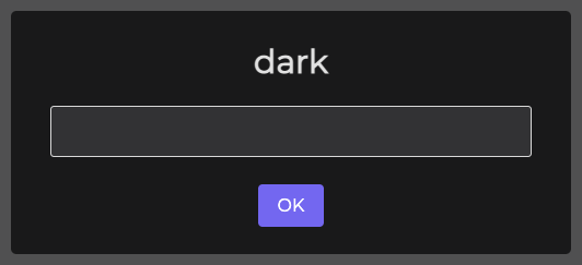
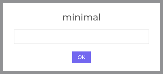
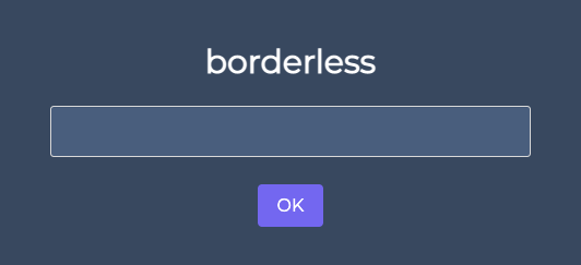
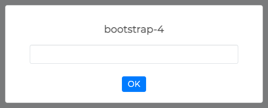
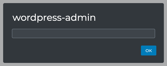
Swal.isLoading()Determine if popup is in the loading state. Related methods: Swal.showLoading() and Swal.hideLoading()
Swal.getTimerLeft()Returns the time left in case when timer parameter is set.
Swal.stopTimer()Stops the timer in case when timer parameter is set. Returns the time left
Swal.resumeTimer()Resume the timer previously stopped. Returns the time left
Swal.toggleTimer()Toggle state of the timer between stopped and running. Returns the time left
Swal.isTimerRunning()Returns the status of a timertrue if is running, false if it's paused
Swal.increaseTimer(n)Increase the timer by n milliseconds. Returns the time left
Swal.clickConfirm()Click the "Confirm"-button programmatically.
Swal.clickDeny()Click the "Deny"-button programmatically.
Swal.clickCancel()Click the "Cancel"-button programmatically.
Swal.getInput()Get the input DOM node, this method works with input parameter.
Swal.disableInput()Disable input. A disabled input element is unusable and un-clickable.
Swal.enableInput()Enable input.
Swal.showValidationMessage(message)Show the validation message DOM node.
Swal.resetValidationMessage()Hide the validation message DOM node.
Swal.getValidationMessage()Get the validation message DOM node.
Swal.isValidParameter(param)Determine if parameter name is valid.
Swal.isUpdatableParameter(param)Determine if parameter name is valid for Swal.update() method.

THEMES 

Dark

theme dark

Minimal

theme minimal

Borderless

theme borderless

Bootstrap 4

theme bootstrap 4

Bulma

theme bulma

Material UI

theme material ui

WordPress Admin

theme material ui

Themes Installation

You can install all themes at once:

$ npm install @sweetalert2/themes

Or just a single theme @sweetalert2/theme-<theme_name>, e.g.:

$ npm install @sweetalert2/theme-dark

Or from jsdelivr CDN, e.g.:

<link href="//cdn.jsdelivr.net/npm/@sweetalert2/theme-dark@4/dark.css" rel="stylesheet">
<script src="//cdn.jsdelivr.net/npm/sweetalert2@11/dist/sweetalert2.min.js"></script>

Themes Usage

With CSS:

<!-- Include a required theme -->
<link rel="stylesheet" href="@sweetalert2/themes/dark/dark.css">
<script src="sweetalert2/dist/sweetalert2.min.js"></script>

With SASS:

// your-app.js
import Swal from 'sweetalert2/src/sweetalert2.js'

// your-app.scss
@import '~@sweetalert2/themes/dark/dark.scss';

257

主題

38

回帖

1138

積分

管理員

積分
1138
 樓主| 發表於 2023-5-25 10:50:47 | 顯示全部樓層
https://sweetalert2.github.io/#examples

257

主題

38

回帖

1138

積分

管理員

積分
1138
 樓主| 發表於 2023-5-25 10:50:55 | 顯示全部樓層
        Swal.fire({
              allowOutsideClick: false,
            icon: 'error',
            title: 'Oops...',
            text: '請輸入帳號!'
         
          }).then((result) => {
                          /* Read more about isConfirmed, isDenied below */
                          if (result.isConfirmed) {
                                Swal.fire('Saved!', '', 'success')
                          } else if (result.isDenied) {
                                Swal.fire('Changes are not saved', '', 'info')
                          }
                  });
                       
您需要登錄後才可以回帖 登錄 | 立即註冊

本版積分規則

Archiver|手機版|小黑屋|DoIT 科技論壇

GMT+8, 2025-6-15 11:18 , Processed in 0.019914 second(s), 18 queries .

Powered by Discuz! X3.5

© 2001-2024 Discuz! Team.

快速回復 返回頂部 返回列表